Recently studied Record Album design, taught by Peter Cardoso (Ghost Town Studio). Here are a couple record album covers I designed during the class:
During the pandemic, I started watching surf and skate videos on Youtube. I became a fan of Noa Deane, who has put out a couple albums under the band name "Blistar." I decided to design a new logo for his band, based on the Australian flag. The overall color scheme is based roughly on his first album. For the vinyl sticker, I designed a logo for his name, utilizing the N as a lightning bolt. The diamond shape in the back is meant to suggest the O and the A in his name, as well as the D in Deane.

I am a huge fan of the White Stripes (they're what inspired me to start playing guitar in 2001, and to write a musical for the first time). I've always dreamed of illustrating "Lafayette Blues" by drawing all 25 Detroit streets mentioned in the lyrics, and I finally achieved that dream:

Of course, the front cover has to be "Le Rouge," and the back cover, "Le Blanc." For the vinyl sticker, I chose "Le Roy."


Over the pandemic, I also became a fan of "BTS." So for my final project, I thought it might be fun to do a color wheel on the album cover design. I found out that the band members constantly change what they say is their favorite color, and most of them choose colors not feature in a typical color wheel, like pink, grey, and black. I decided to do a choose-your-own-color type thing, where a person can rotate the wheel to change the colors underneath each band member. Then I thought--why not be able to mix-and-match their headgear too? It's not as if several of the members haven't worn flower crowns, bucket hats, baseball caps, or crowns.

So there are three transparent wheels:
One of colors, one of their faces, and one of different headgear--all of which you can rotate around.


The title of this design is "Richard of York Gave Battle in Vain." This is a mnemonic, like Roy G Biv. The final design looks a little bit like a dart board, which seems to fit the band's "Bulletproof Boy Scout" theme, as well as the circular motif found on a few of their albums.
This might make a cool cover for a compilation of free songs they've written for their fans, "Army."
********************************************************************************
One of my favorite bands of all time is Blur. I decided to experiment with making merch designs for them--here are some patches where I combined the Tudor rose with the band name:

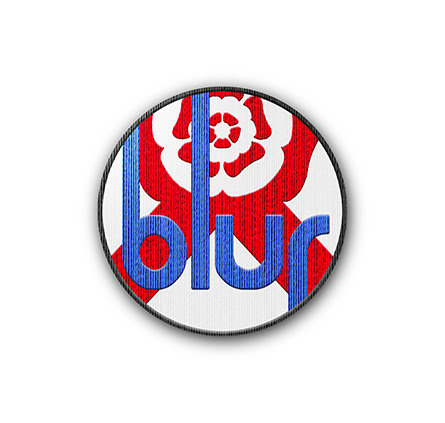

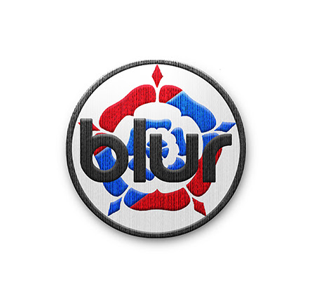
Here are some variations of the designs, as they would look as buttons (badges):


There's a cool comic book shop called "Gods & Monsters"--I decided to design a new logo for them, and place it on a tote bag and a lanyard/badge. When trying to decide what to do with the ampersand, I came up with the idea of having an upside-down version. It comes from the concept that what is above and what is below, are reflections of one other. The letters are transparent, so where they meet, there is darkness.


No comments:
Post a Comment